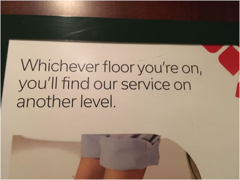
Eternal Service Limbo: Help on Another Level
Imagine seeking assistance in a building, only to be caught in an endless loop of confusion. This comical marketing fail features signage promising that no matter which floor you’re on, their service can be found on another level.
Source: Reddit
The unintentional irony had people laughing and comparing it to an unattainable goal, like finding the princess in another castle. It also depicts frustrating experiences in bureaucratic agencies, where getting help seems to be an eternal quest.
A Future Too Close for Comfort
This graduation photography ad took a humorous turn with its unfortunate choice of setting. The image features a graduate standing on train tracks with the caption, “Look to the Future.” Online users couldn’t help but chuckle at the irony, pointing out the potential danger of the oncoming train as the embodiment of future challenges.

Source: Reddit
The ad unintentionally evokes the grim realities of student loans, unpaid internships, and minimum-wage jobs waiting in the outside world.
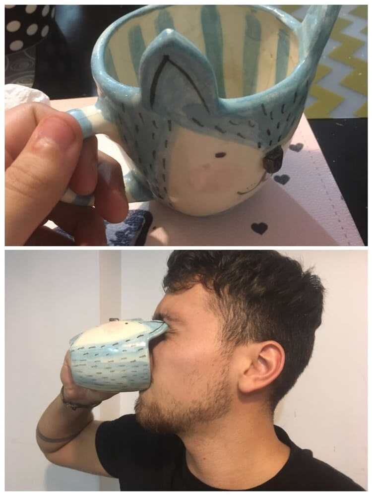
What a Wake-Up Tool!
This coffee mug has a comical appearance that resembles an eye poker. It’s not your typical mug and stands out in a crowd.
Source: Imgur
Perhaps the designer intended to create a mug to help users wake up in the morning by poking into their veins and eye sockets. Imagine struggling to wake up early with groggy, sleepy eyes. It’s not an appealing picture, is it? Regardless of the original intention, this mug’s unusual design will make you wonder.
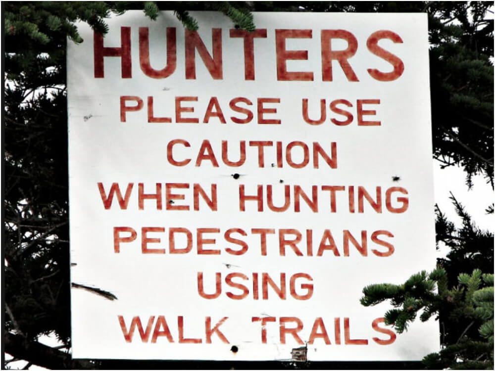
Evidence That Commas Save Lives
Not only is this a design failure, but it also displays a lack of grammatical understanding. Just look at how this individual turned their message into a joke. What was meant to be a warning now seems like a humorous mistake.
Source: Reddit
It’s clear that basic grammar lessons were overlooked, and this designer’s work may be one of the top hilarious design failures on the internet. This embarrassing situation could have been avoided if more attention had been paid to grammar.
A Good Way To Console a Scam-Victim
Picture this: a customer reports being scammed, and the website bot responds with a nonchalant “Great.” This is enough to make you question the ethics of the entire PayPal programming team.

Source: Imgur
Such system failures are unacceptable, and the possibility of sarcasm only adds insult to injury. As a consumer, you deserve better than this. Companies need to prioritize ethics and accountability in their programming practices.
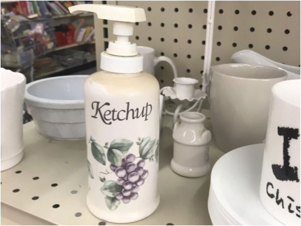
An Appealing COncoc of Ketchup, Liquid Soap, and Grapes
Well, well, well, what do we have here? A soap dispenser with a ketchup label and a grape picture? It’s definitely a design fail of epic proportions.
Source: Imgur
And the mystery doesn’t end there—what kind of fragrance does this soap have? A fruity and spicy tomato flavor, perhaps? Who knows what weird concoction the designer came up with. One thing’s for sure, it’s definitely a crazy combo that’s bound to leave you scratching your head and laughing out loud.
You Could Call It an Isolated Refrigerator Space
While the idea of locating the fridge in the middle of the kitchen may seem amusing, it’s worth noting that people have come up with all sorts of unconventional arrangements for their homes. Some may even find this concept intriguing and adopt it in their apartments.

Source: Reddit
Humans are naturally curious and always looking for new ways to innovate and experiment. So, while the notion of a “self-sufficient” fridge may be humorous, it’s not entirely impossible that someone might try to make it a reality.
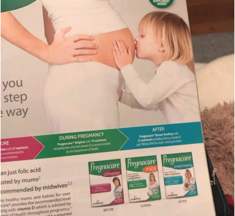
Baby Care Booklet Placement Fail
The placement of the baby care booklet within this magazine was cheeky! At first glance, it appeared like a young girl was kissing a baby’s bottom – not exactly what you want to see when flipping through a magazine!
Source: Reddit
However, when the booklet is flipped, it reveals a picture of the girl kissing her mom’s baby bump. Phew, crisis averted! Who knew baby care tips could be so stirring and hilarious?
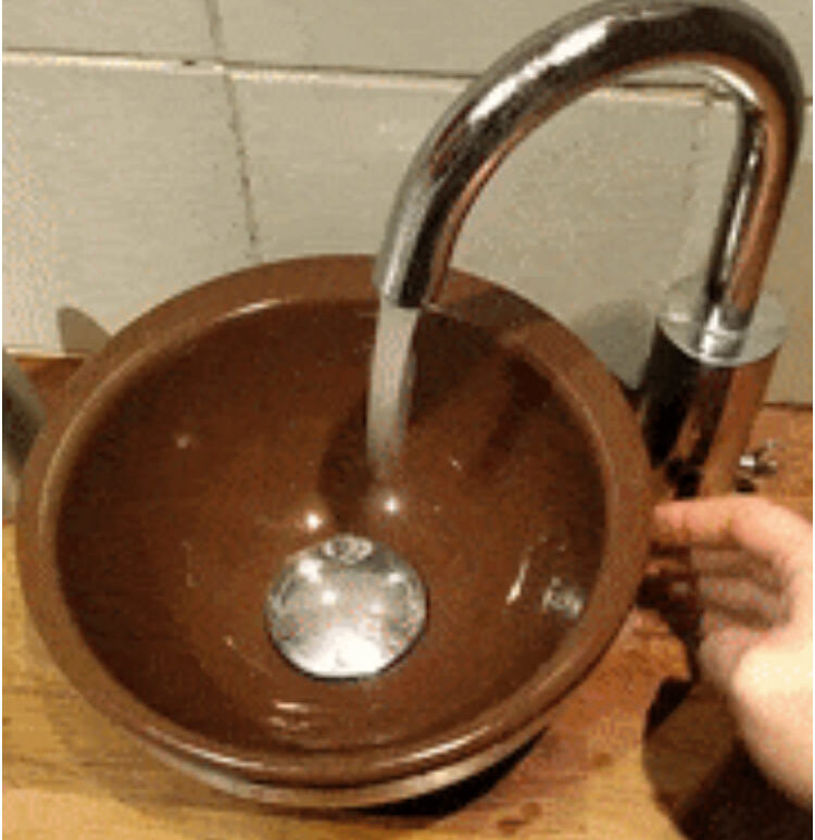
Genius Washbowl: A Design Masterpiece
Oh, how technology always fails us in the most unexpected ways! What’s more interesting than a washbowl with a sensor malfunction? When users remove their hands, water flows freely.
Source: Reddit
Incidentally, the moment they put their hands back under the tap, the water suddenly stops—how considerate! Even in this era of advanced technology, our devices can still behave unpredictably and confusingly.
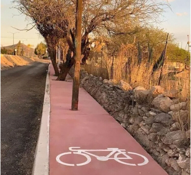
When Trees Take Over: Bike Lane Edition
It’s hard not to laugh when you see a picture of a bicycle lane taken over by trees. This photo shows a beautifully designed tree-lined street with a bike lane painted right in the middle of the foliage.
Source: Reddit
While it may look lovely, the design has a major flaw—the trees have grown too wide and now sprawl the bike lane, making it virtually impossible to use. It’s a reminder that even the most well-intentioned designs can turn sour if not properly maintained.
Math-less Designers: Password Prompt Fails
We’ve all been there—setting up an account and being prompted to create a passcode. This particular prompt had users stumped. The instructions asked them to input the answer to 5 x 2, but there is no zero on the given number pad.

Source: Twitter
Yep, you read that right. So, do you enter “10” or “52”? Is this a math problem or a test of your ability to identify design failures? Who knows.
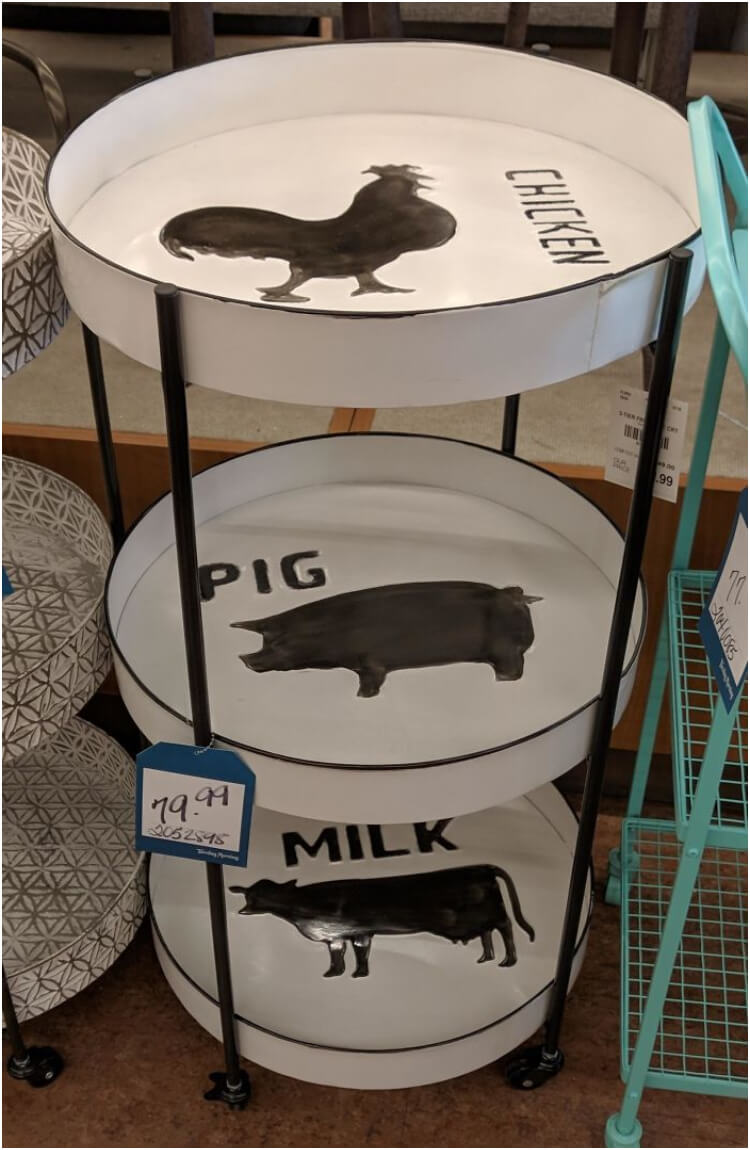
Animal Rack Fiasco
Looking for a rack that will make you laugh every time you use it? Look no further than this gem. The rack is designed with three compartments, each with a witty image and inscription. The first compartment features a chicken with the word “chicken.”
Source: Reddit
The second features a pig with the word “pig.” Finally, the third compartment has an image of a cow with the word “milk.” Maybe the designer missed that milk is not a cow?
The Monkey-Friendly Security Gate
Security gates are safe and secure. That’s why hiring maintenance professionals, like the ones in this picture who put updated locks and handles on the gates, is so crucial. But wait, what’s that opening for?
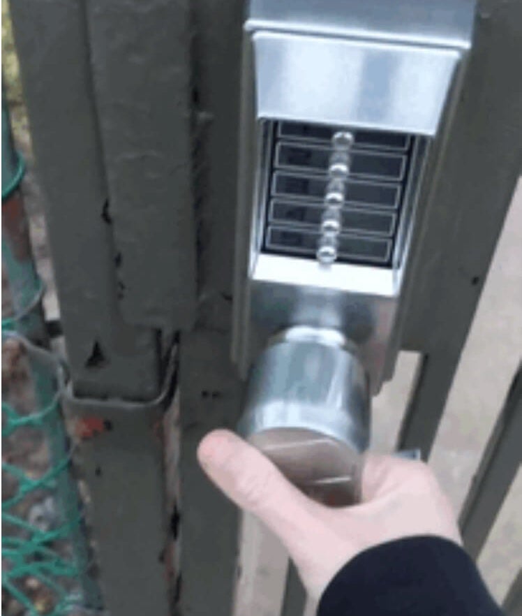
Source: Reddit
Could it be a secret entrance for tiny burglars? The designers forgot the most basic rule of security: never leave a hole where someone could stick their hand in and unlock the door. Well, guess the residents are open to all “visitors.”
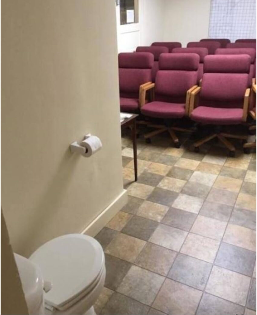
Meeting Room That Doubles as a Torture Chamber
Welcome to the most awkward meeting room ever! New visitors will wonder how they ended up in this tiny room with the worst chairs ever.
Source: Twitter
Oh, and did we mention that there is also a toilet here, just in case the meeting gets too long and you need a break? However, remember to bring your toilet paper, as only one roll is mounted on the wall.
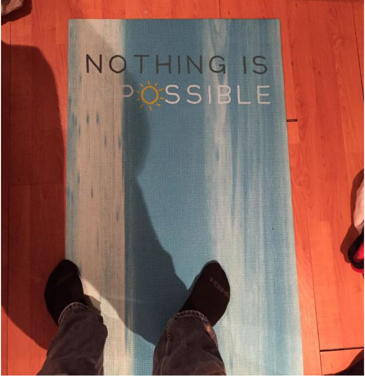
From Inspiration To Defeat
Ah, yoga, where you stretch your body and mind. But what happens when your yoga mat turns pessimistic? Take this mat, for example, with the phrase “Nothing is impossible” written on it.
Source: Reddit
That’s a great message to inspire you during your yoga practice, right? That is until you see the white background of the mat covers the first two letters, leaving only the word “possible.” So now, instead of feeling empowered, nothing seems possible. Think we’ll need to invest in a new yoga mat.
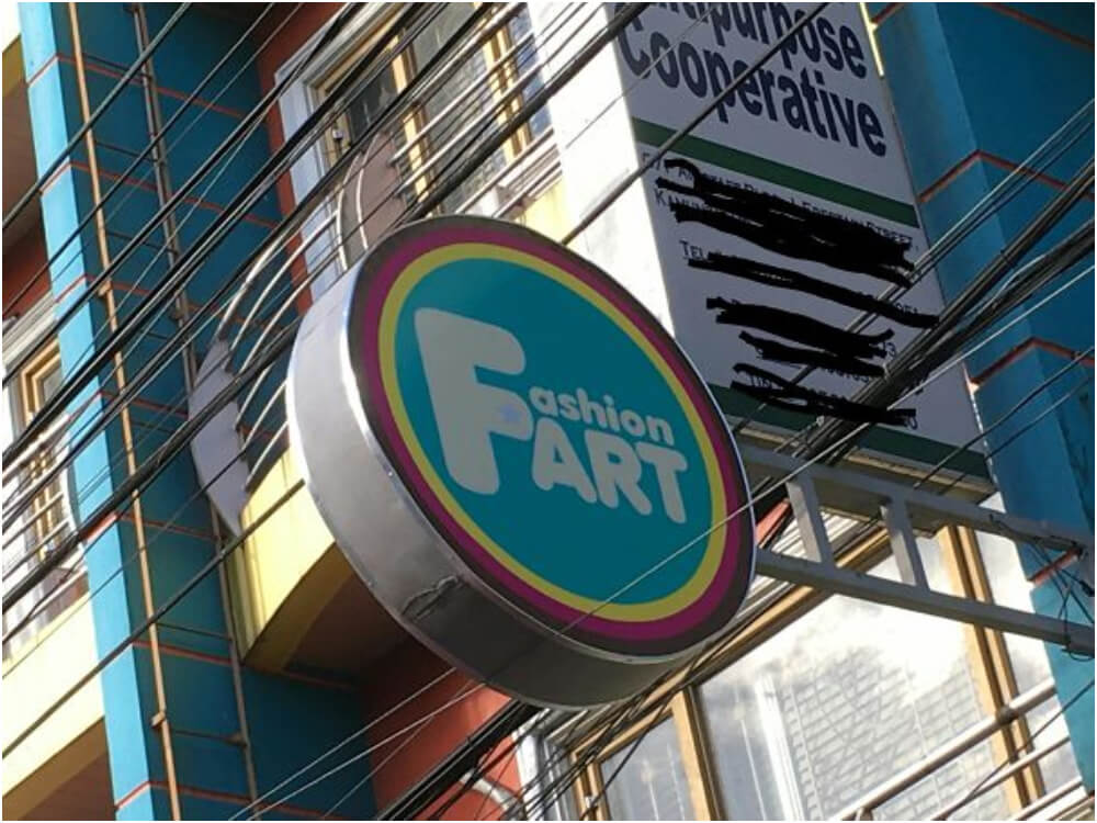
Unconventional Advertising in Fashion
Fashion trends can be pompous at times. But this business takes it to the next level with its advertising light box, proudly proclaiming, “Fashion Fart.”
Source: Imgur
It’s unclear if it meant to say “Fashion Art” or wanted to promote fashionable farts, but it’s an unconventional marketing approach. We don’t know if we’re more intrigued or disturbed, but one thing’s for sure—it’s memorable.
Positive Thinking Gone Wrong
When delivering congratulations, there’s a right and wrong way to do it. Unfortunately, this card seems to have taken the latter approach, with a greeting that reads, “Congratulations, you have cancer.”
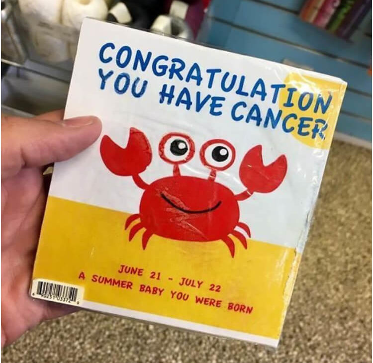
Source: Reddit
The intention was to be congratulate new parents on their baby born in July. Unfortunately, a grammatical hiccup derailed the good news. One Reddit commenter joked, “Cancer. The real zodiac killer.”
The Hilarious Shortening of Short URLs
Who needs a full URL anyway? This designer thought it would be hilarious to create a website that shortens already shortened URLs! Yes, you read that right—it’s been a #DesignFail for ages!
Source: Reddit
Don’t take our word for it. Check out this picture and marvel at the absurdity. Is it a joke? Is it a prank? Or is it just genius? You be the judge, but one thing’s for sure—this #DesignFail will have you scratching your head.
The Bizarre Transformation Tale
This has left us perplexed and amused. The image shows a transformation from a white, overweight man to a fit, muscular black man. This leaves us scratching our heads and laughing out loud.
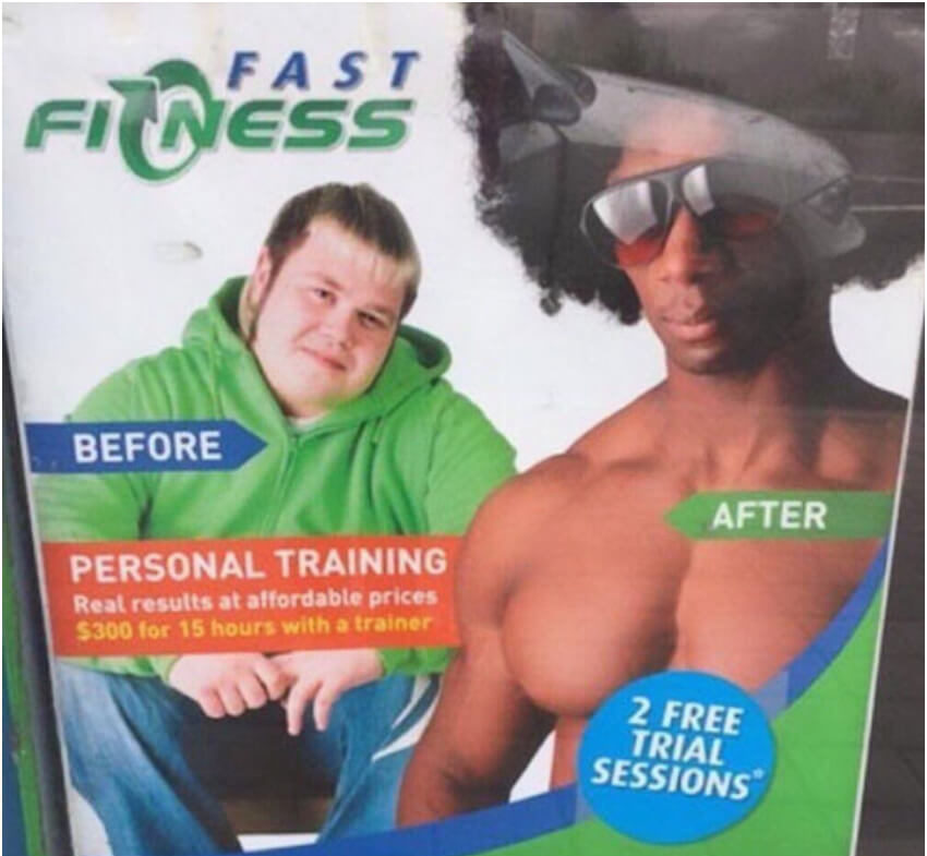
Source: Reddit
It’s unclear what the designer was aiming for with this image, but unless they were gunning for laughs, it’s safe to say they missed the mark. The sudden transformation is both absurd and comical. While this image may be the ultimate transformation story, we can’t help but marvel at its absurdity.
The Confusing Sale of Sasa Lele
Sale, sale, 50% off at Sasa Lele? Something funny about this image is that the designer broke the name apart and turned it into a discount offer.
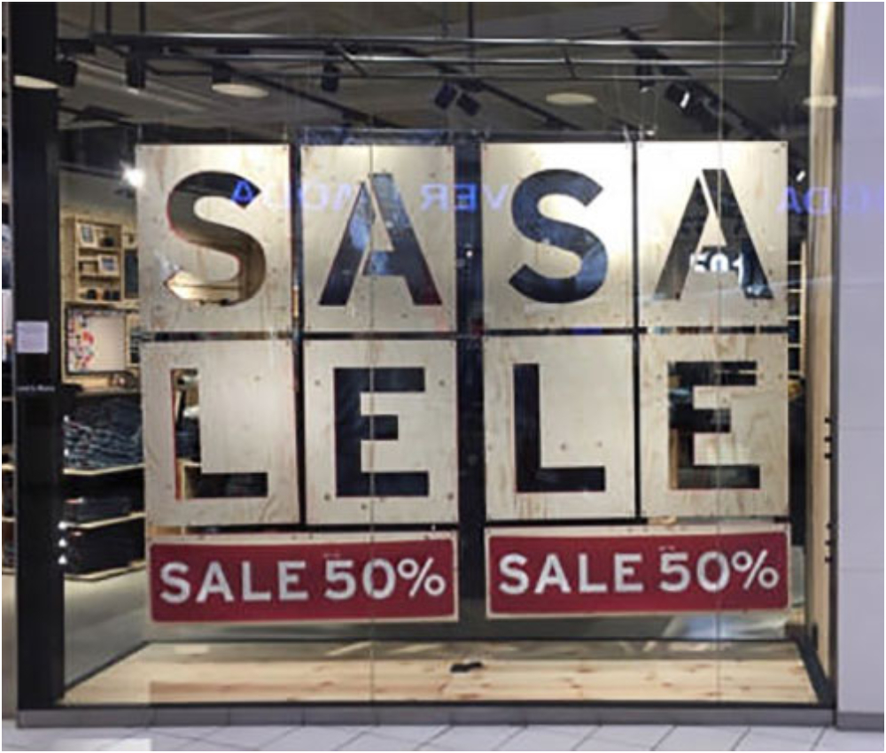
Source: Reddit
Check out this hilarious picture of a sale that’s too confusing to be real! Is it a mistake? Is it a prank? Or did the designer forget how to spell? Whatever the case, we can’t help but chuckle at this epic fail.
Disturbingly Absurd Design Warning
The design in question is both disturbing and perplexing. The solution proposed on the poster is unrelated to the image itself—it advises dog owners to keep their pets on a leash and clean up after them. This juxtaposition creates an incredibly bizarre and unsettling image that is difficult to comprehend.
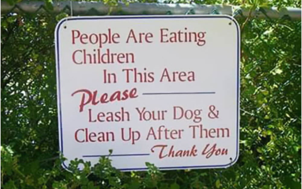
Source: Reddit
It’s unclear what the designer’s intention was with this poster. Was it intended to be a humorous take on a serious issue or a warning about something more sinister?
Death Trap Bike Lane Design
Attention all cyclists! We have a design fail, and it’s a doozy. The designer of this bike lane needed to remember one crucial element—protection! Check out this picture of a bike lane on a bridge with no guardrails.
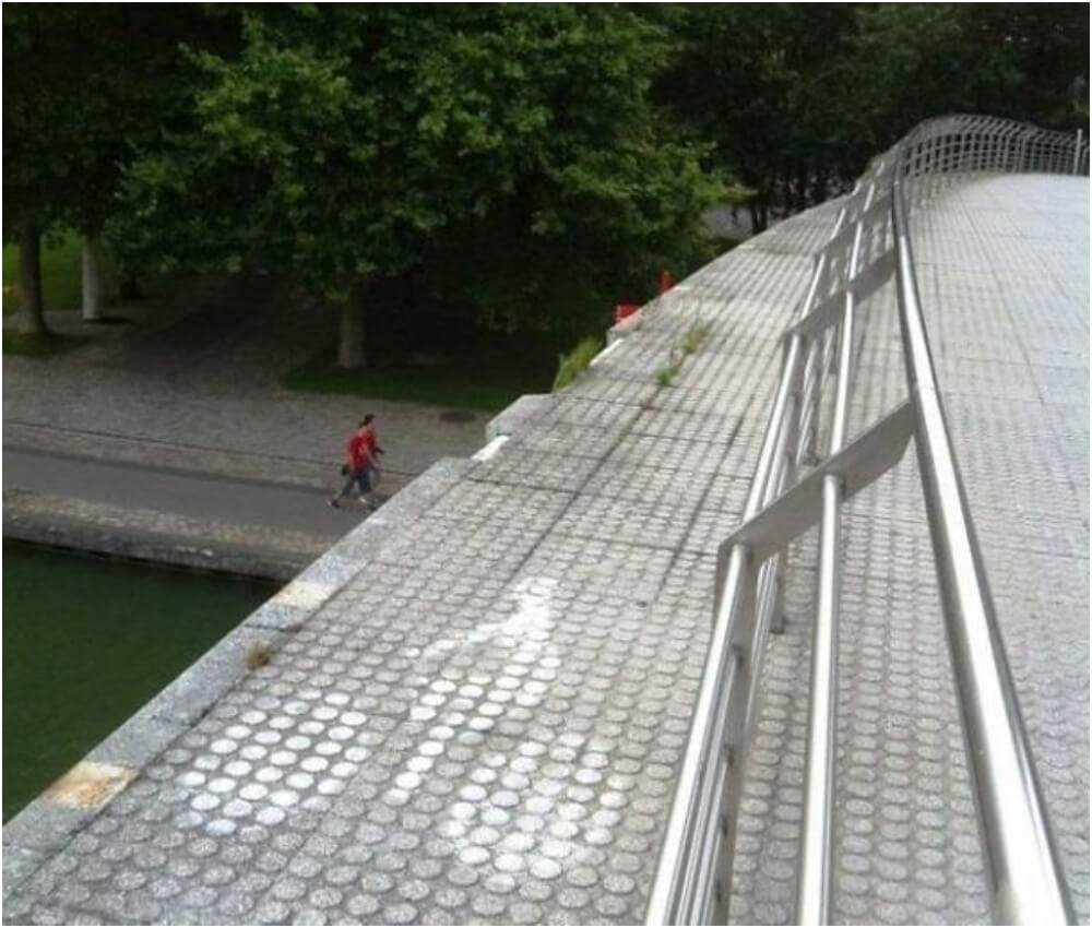
Source: Reddit
Why is nobody using it, you ask? Probably because it’s a death trap waiting to happen! We’re still determining what the designer was thinking, but one thing’s certain—this is not the bike lane of your dreams.
An Electrician With a Touch of Disaster
The electrician who installed the switch appears to have failed to separate the circuits. Flipping the light switch off causes the elevator to lose power, indicating they are on the same circuit.
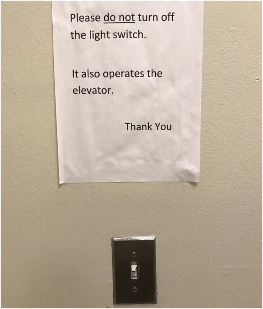
Source: Reddit
This oversight could result from a lack of attention to detail or electrical system knowledge. To avoid further mishaps, it is important that a qualified electrician be called in. How a certified electrician makes such a blunder still beats our imagination.
The Worst Carpenter in the History of Carpentering
Another design fail thanks to the carpenter in charge. As the carpenter broke another part of the wall to install the window and left the original space unfilled, it is unclear what their thought process was.
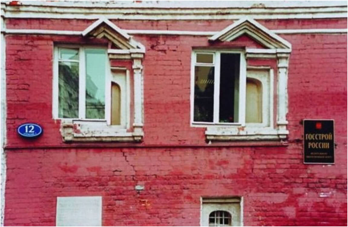
Source: Reddit
The apartment owner should get a refund if they haven’t already. They should also employ a skilled carpenter to undo all the damage and get it up to code.
A Brief Warning Message Is Most Effective
Car manufacturers could use concise language to shorten the warning, such as, “Distracted driving is dangerous. To avoid accidents and injuries, keep your eyes on the road.” Another option is to use a visual aid, such as an eye-catching graphic or animation, to reinforce the message rather than relying on lengthy text.
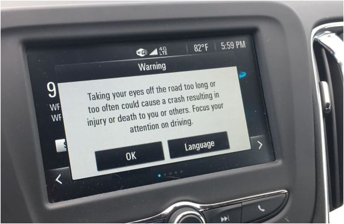
Source: Reddit
They could also use a catchphrase or slogan that encapsulates the core message, like, “Stay focused, stay alive” or “Eyes on the road, not your phone.”
The Perfect Drink Holder
Using a rubber ducky as a drink holder may seem quirky and playful, but beware of the potential drawbacks. Your drink may not float evenly on the duck’s back, causing spillage and ruining your day.
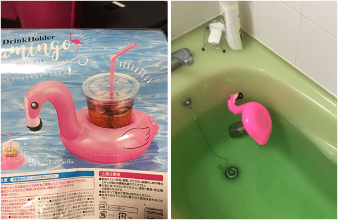
Source: Reddit
Plus, the duck’s surface may harbor bacteria that could contaminate the drink, and cleaning it thoroughly can be a hassle. So, think twice before using a rubber ducky as a drink holder and consider a safer and more hygienic option.
Tiger’s Growth: More Frightening Than Adorable
Picture an ad showing a tiger’s growth over 10 years. Sounds heartwarming, right? Well, not quite! Instead of a cute comparison, this ad portrays an adult tiger appearing to devour the person who nurtured it as a cub!
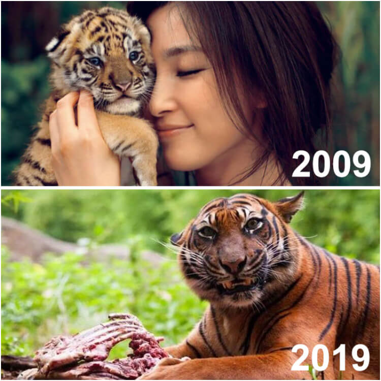
Source: Reddit
While the creators might have aimed for an endearing effect, the ad reminds us that wild animals are not meant to be pets.
Just Pay for Your Coffee
On to our last item on epic design fails. The phrase, “Before you leave, forget to pay” is contradictory and could be interpreted as everything in the coffee shop being free.
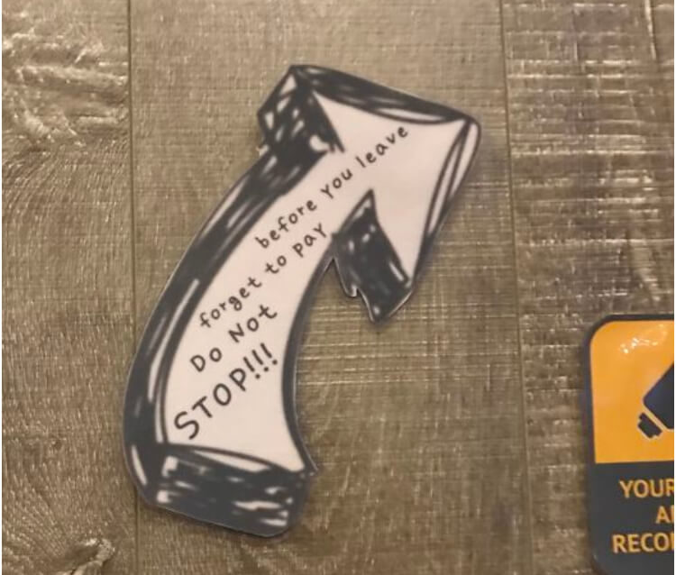
Source: Reddit
The phrase “Do not stop” is also ambiguous and could be misinterpreted as a command not to stop at the register to pay. Overall, the write-up should be clear. We recommend everyone to ignore it and pay for coffee to avoid issues.