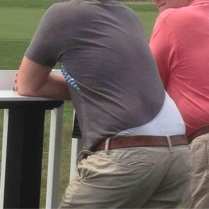
The Wedgie Shirt
Now, multi-colored shirts can be great. The key word is “can.” To have more than one color shirt is risky, however, because the colors can clash with each other. Or, they can fit awkwardly together. This next shirt design is an example of the latter.
SOURCE: IMGUR
Instead of a stylish two-tone shirt, it looks like the guy above has a massive wedgie. Someone’s tighty whities pulled up far beyond the belt buckle. Oh, wait – that’s the t-shirt design. Yikes! Perhaps the designer never took the time to look at the shirt from behind.
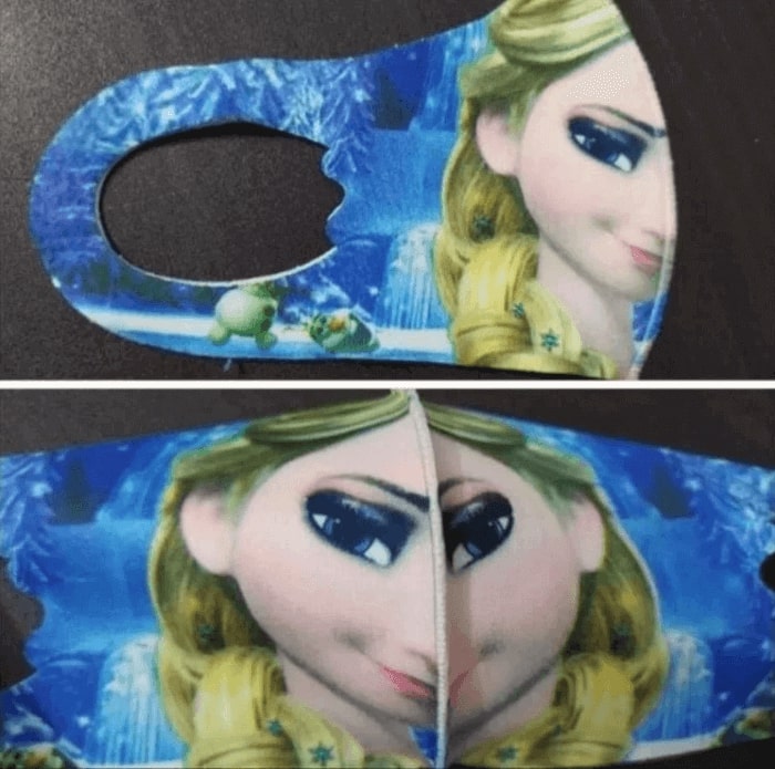
The Frozen Face Mask
Elsa from Disney’s hit film Frozen is one of the most recognizable animated characters around. So, it’s no wonder that her image was plastered on a face mask – one of the most common bits of clothing around in pandemic times. It looks great from one side.
SOURCE: REDDIT BY U/FARISFRONTIERS
However, when you open it up, things change quite dramatically. A self-confident smirk turns into a full-on mischievous frown. If you’re wearing that while trying to talk to someone else, it’s sure to freak them out a bit. In other words, to leave them frozen!
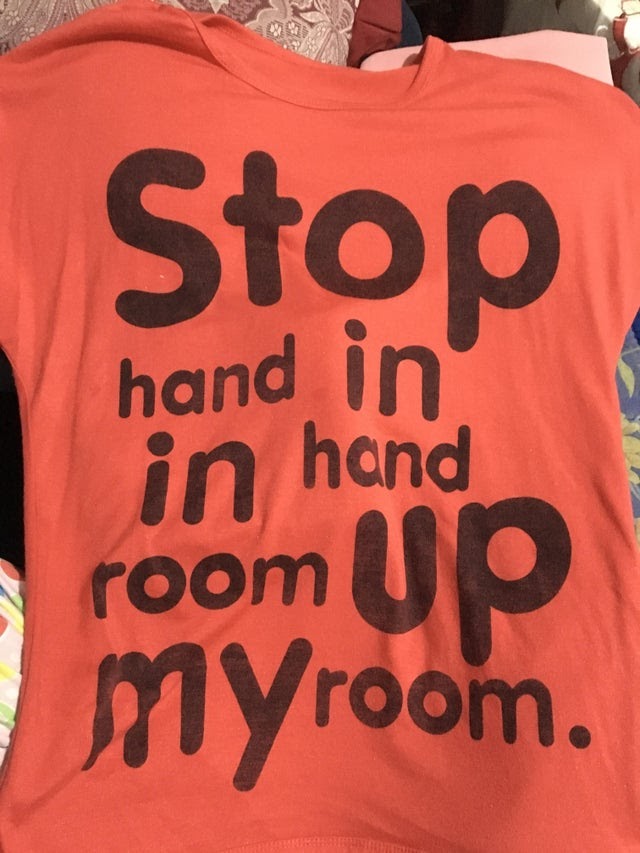
The Makes No Sense T-Shirt
Unlike the wedgie shirt above, the shirt below has a single color all throughout. That’s good. What’s not so good is the writing splayed all over the single color. Each individual word makes sense and has a definite meaning – stop, hand, in, room, my, and up.
SOURCE: REDDIT BY U/SOPHIEYUH
However, the way the words are put together makes absolutely no sense. Either the t-shirt was designed by a non-native English speaker or some kind of absurdist poet who enjoys rambling about things that make no sense. The fact that the design made it into stores is more troubling.
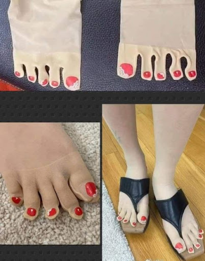
The Painted Toe Stockings (??)
Although fun stockings are, well, fun, the ones below are plain creepy. Rather than a wacky multi-color design or an alternative pattern of pineapples and hippos, these stockings try to look like actual feet. More than that, like feet with painted toenails.
source: REDDIT BY U/PKKBALLER22
When you put them on, it simply makes you look like you have creepy feet on top of your feet. The fact that they don’t quite fit makes it seem like something a serial killer might do. Is that their market? If so, we don’t want to meet the designer.
Russian Doll Heels
Russian dolls are well-known and loved because there’s something oddly satisfying about putting small dolls inside progressively larger dolls. They all fit together in this weird pattern of self-similarity. Well, the designer’s heel below managed to apply that idea to heels to create what you might call Russian doll heels.
SOURCE: IMGUR
As you can see above the “heel” of the heel is simply another tiny heel. Although it doesn’t seem to continue, it does make us want to pull out a microscope to see if the tiny heel has its own little microscopic heel too!
Blood or Paint Pants
Some colors go together like brown peanut butter and purple jelly. Others don’t. Either they clash in a way that’s not appealing to those who love clashing colors or the color looks like something else. The two-tone pants below have the second problem.
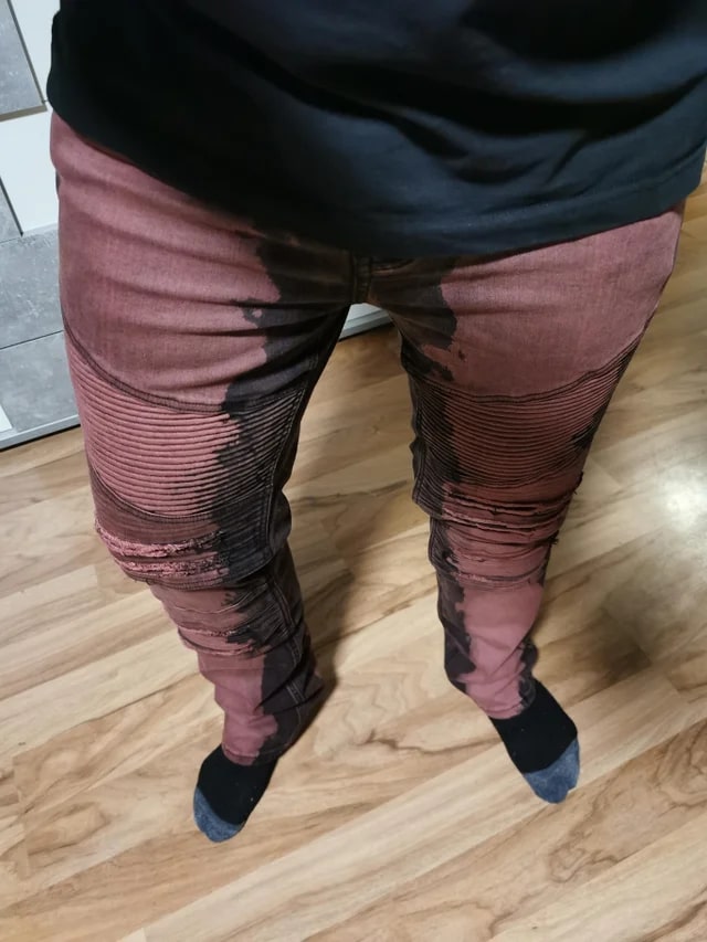
SOURCE: REDDIT BY U/LORD_H1D30U5
The red that goes down the entire front looks like a bunch of dried paint (or a bunch of dried blood) has spilled on the pants. Unless you’re a messy painter or you’re filming a horror film, these jeans don’t give off a good feel.
I Miami
Now, the “I Heart” shirts have been around for quite some time. Like “stay calm”, it’s easy to adapt the t-shirts to show love for anything from cities to people to movies. That being said, it does still take some skill to pick out the right color scheme.
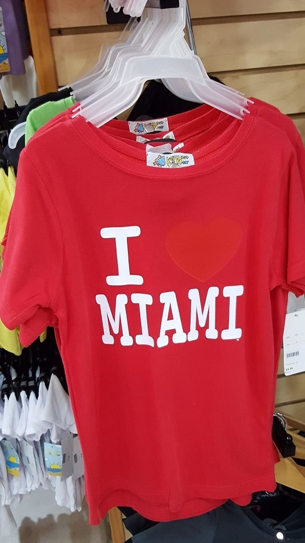
SOURCE: FACEBOOK
Whoever designed the t-shirt above clearly failed at that. Why they thought a red heart on a red t-shirt would, somehow, turn out well is beyond us. It looks more like “I Miami,” which is kind of an odd statement to say unless your name is in fact Miami.
Geography Time
Geography is not the strong suite of many people – in particular, the people who designed the t-shirt below. In their race to create a global t-shirt to appeal to fashionable travelers everywhere, they forgot quite a few details.
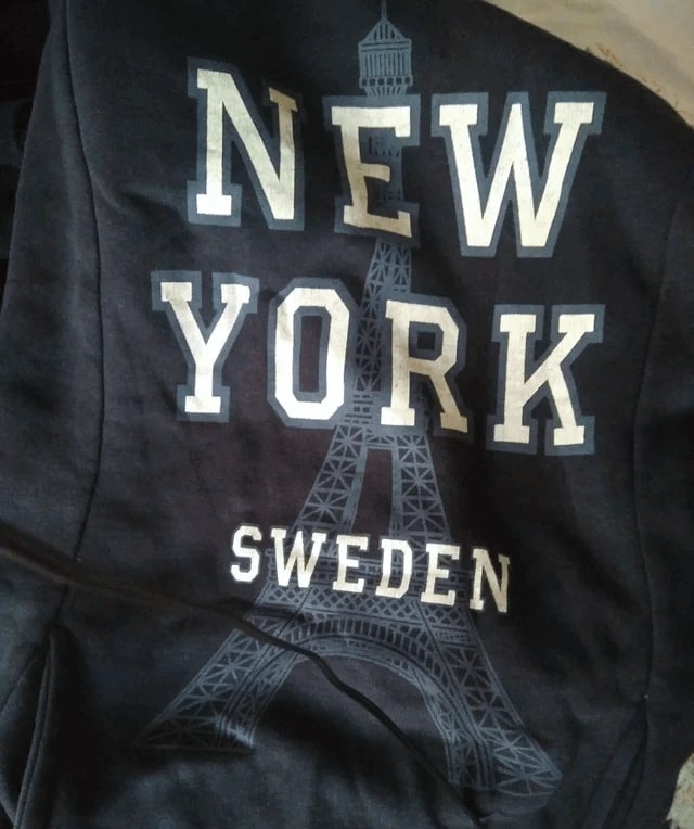
SOURCE: REDDIT BY U/DAMLA_IS_CRINGEY
First, New York and Sweden are not the same thing. New York is a state in the U.S. (or a way to abbreviate New York City). Sweden is a country far away from the U.S. Lastly, the Eiffel Tower picture in the background is in Paris, France.
Imagine, Indeed
Like the “makes no sense t-shirt” above, this sweater is full of words that have clear definitions. Words like imagine, how, touch, is, the, and sky. However, when put together, those words aren’t, well, put together.
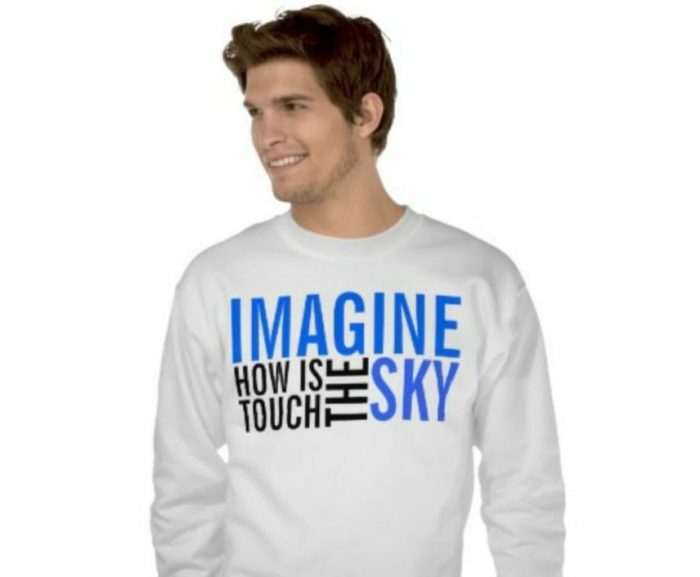
SOURCE: IMGUR
This leaves the sweater wearer with a weird statement: Imagine how is touch the sky. Inspirational, huh? Well, maybe not – but, it is fun to try and coax out as many different sentences as possible. Although that may not be inspirational, it’s certainly a creative use of time. Always look on the bright side.
Translucent Visor
Visor hats are not super popular, but they have a respectable audience for people who have two needs. The first is to not mess up their hair. Visors, unlike regular hats, go around your head rather than covering the top. This means you’re not going to get hat hair.
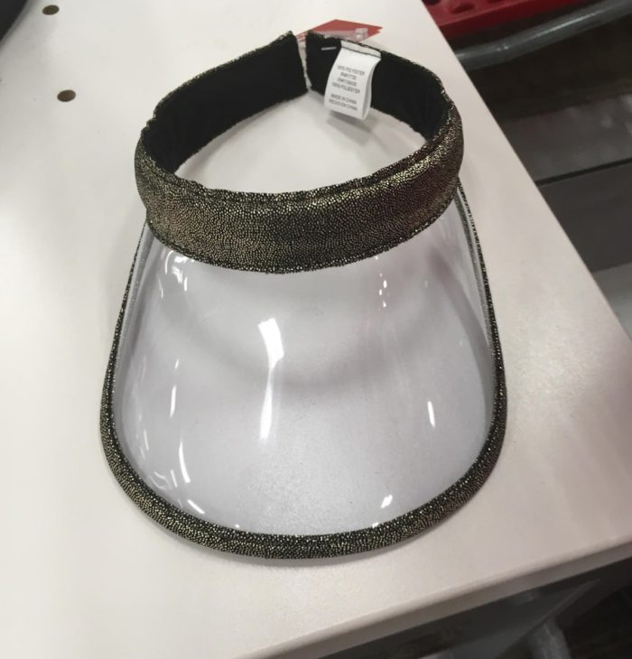
SOURCE: REDDIT BY U/LUIS_1063
The second reason is to cover your eyes from the sun’s harmful rays. That’s where the designer of this visor runs into trouble. The fact that it’s transparent means the sun goes directly through the visor – and into your eyes.
Pasta Jerseys
With an estimated four billion fans (or, roughly, one out of every two people), football (called “soccer” in the U.S.) is by far the most popular sport on earth. That means football jerseys are some of the most recognizable designs on earth. A lot of thought goes into designing them.

SOURCE: REDDIT
Well, most of them. The jersey’s below, however, seems to be inspired by a food fight that got a little out of hand. The mix of yellow, red, and orange looks like a big old plate of pasta.
12. Give Up T-Shirt
Inspirational messages on t-shirts are all the rage nowadays. As we saw from the “imagine, indeed” t-shirt above, these inspirational messages don’t always make sense. Luckily, the one below does make sense. However, it’s not exactly inspirational.
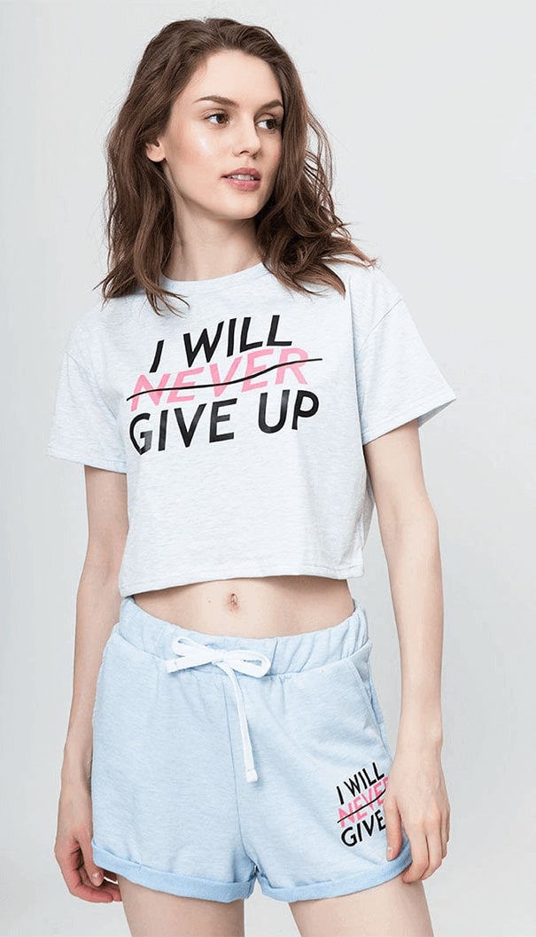
SOURCE: REDDIT BY U/RICETOMEATYA
Instead of an affirmative, “I will never give up,” it’s a more fated “I’ll give up.” Maybe that’s good, to be honest. Sometimes the best thing you can do is give up on something that’s way too beyond the pale. So, oddly enough, the shirt does seem inspirational because it asks people to be more modest.
13. The Sweat and Grease Stain Shirt
Stains are generally something you try to avoid on a t-shirt. That’s particularly true for white t-shirts that make every tiny stain – from a bit of orange juice to a glob of red paint – seem like a catastrophe.
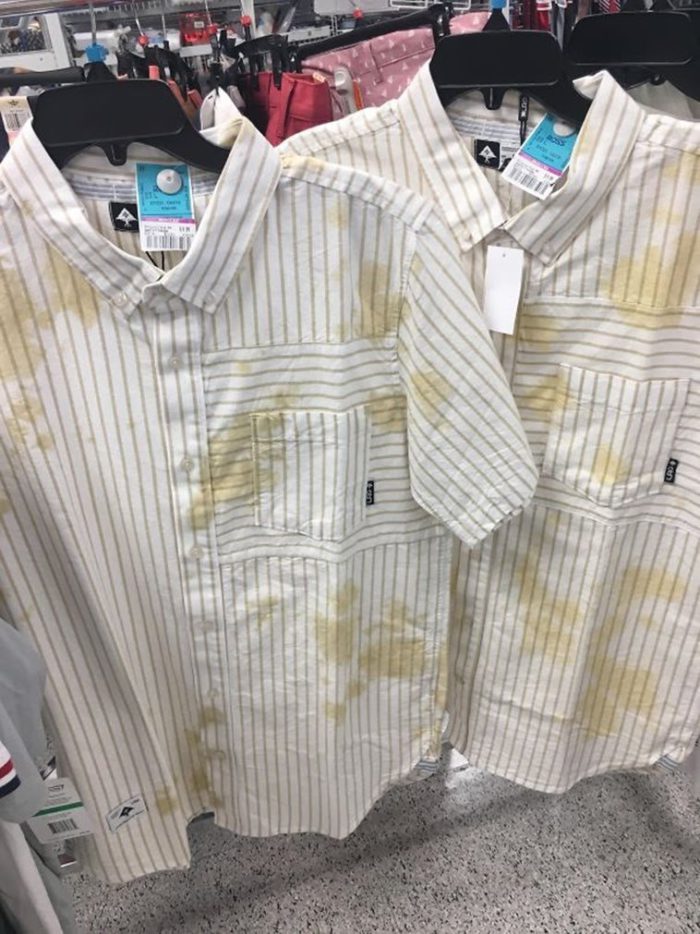
SOURCE: REDDIT BY U/ANXIOUSUNDERLING
Well, the designer above decided to throw that logic on its head. Rather than have people get all worried about staining their nice t-shirt, why not just stain the t-shirt for them! We applaud their innovative thinking, even if the end design looks like a mix of sweat and grease stains.
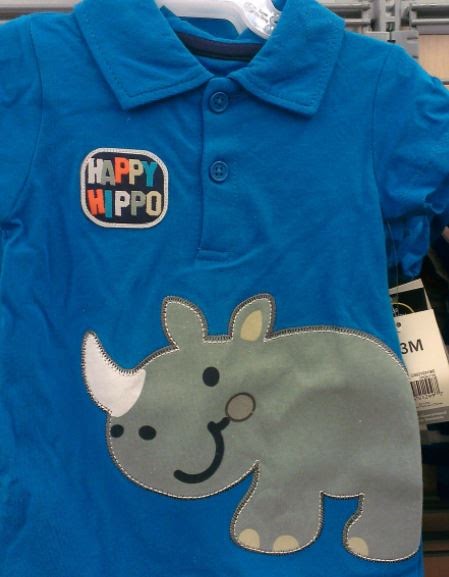
14. Happy Hippno
Kids and animals go together like, well, kids and animals. There’s nothing cuter than a tiny baby and a puppy or kitten hanging out together. That’s why so many children’s clothes designers fill their shirts, pants, and socks with animal designs.
SOURCE: IMGUR
The one above chose the hippo. This animal is known for its massive size, wide face, and single horn. Wait, hippos have horns? Well, it turns out they don’t – rhinos do. So, it seems like like the “Happy Hippo” slogan should change to “Happy Hippno.”
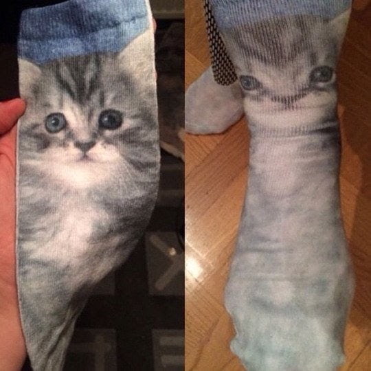
15. Cute Kitten Socks
Nearly all kittens are cute. Alongside their cute little high-pitched meows are their compact little bodies and, of course, their playful behavior. That’s why kittens have sparked huge pop culture and fashion trends such as Hello Kitty.
SOURCE: IMGUR
People want images of cats on shirts, bags, hats, and, of course, socks – those cozy little pieces of fashion that everyone loves to wear. The kitten on the left is cute. However, when you stretch it out to actually fit your feet … the cuteness disappears. It turns creepy instead.